The Bad Economics of wtfhappenedin1971
Disclaimer: Part of my series debunking bad economics on the internet.
TL;DR - Goldbugs are bad at economics
Once in a while, I get asked about the website wtfhappenedin1971.com (let’s call it wtfh1971). I first came across it when Stephen Diehl asked me about it in our interview. But apart from a reddit comment, the website never got the full course debunking I think it deserves. Let’s fix that.
What is this website?
In 75 annotated charts, wtfh1971 unsubtly tries to convince you that end of the Bretton Woods system broke society. Then, of course, wtfh1971 shills bitcoin.
In 1971, you see, the US dollar stopped being convertible to gold. This meant the dollar was now a true floating currency. This is why… uh… people started divorcing more? I’m not joking, that argument gets made. This chart is towards the bottom of the wtfh1971 page:
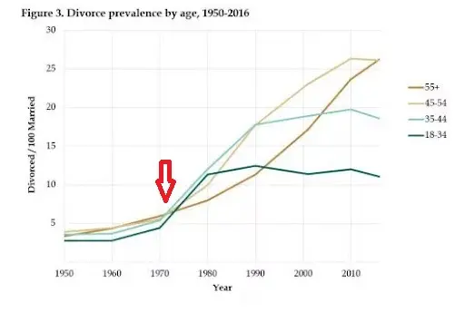
An aside on the divorce rate
Let’s knock this one out of the way now: despite what people at the mises institute would have you think, not a lot of couples divorce because of bitter arguments on the convertibility of the dollar to gold.
The divorce rate increase since 1960 is related to the no-fault divorce laws passing in the US Before that, if a couple went to a court and said “we hate each other, grant us a divorce, please” the judge could legally say “fuck you, you’re still married, work it out” [footnote]One thing wtfh1971 forgot to note is that domestic violence rates have been dropping since we let couples that hate each other divorce, too[/footnote].
Debunking wtfh1971
Debunking Wtfh1971 is an unfair game. The website is the perfect example of the bullshit asymmetry principle. All wtfh1971 has to do is find a chart and put an arrow on it with MS paint, while I’m left explaining everything from why inequality is increasing, to how inflation works, to, apparently, the divorce rate.
Because of this, I’ll separate the mistakes wtfh1971 is making into categories, and debunk those.
We’ve seen on here before how a fixed money supply system like a gold standard or a bitcoin standard is a bad idea. I didn’t cover the obvious link to the divorce rate, but nonetheless maybe go read that because I’ll try not to repeat myself too much.
Theme 1: Productivity vs wages
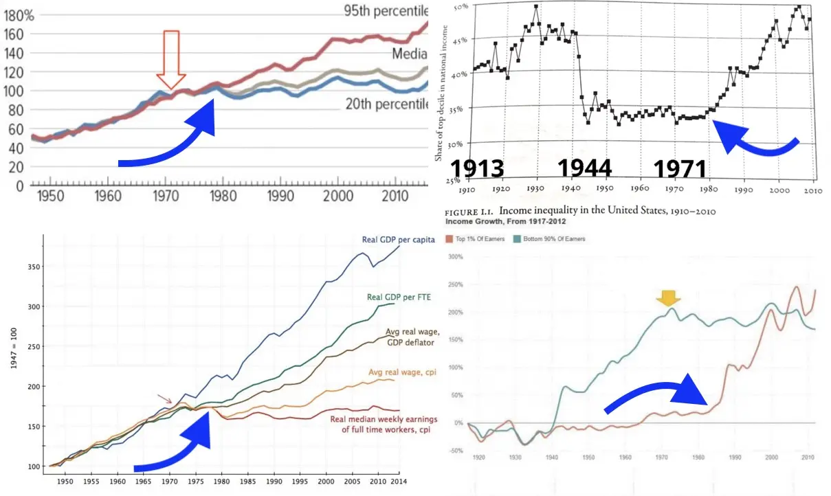
The first kind of graph in wtfh1971 implies the decoupling between GDP growth and labor income happened in 1971. You see this in the first 10 graphs, like this one:
![]()
This is starting on the wrong foot. The idea that 1971 had anything to do with the productivity-wage divergence is a stretch because even the EPI who made that graph put the divergence at 1978:
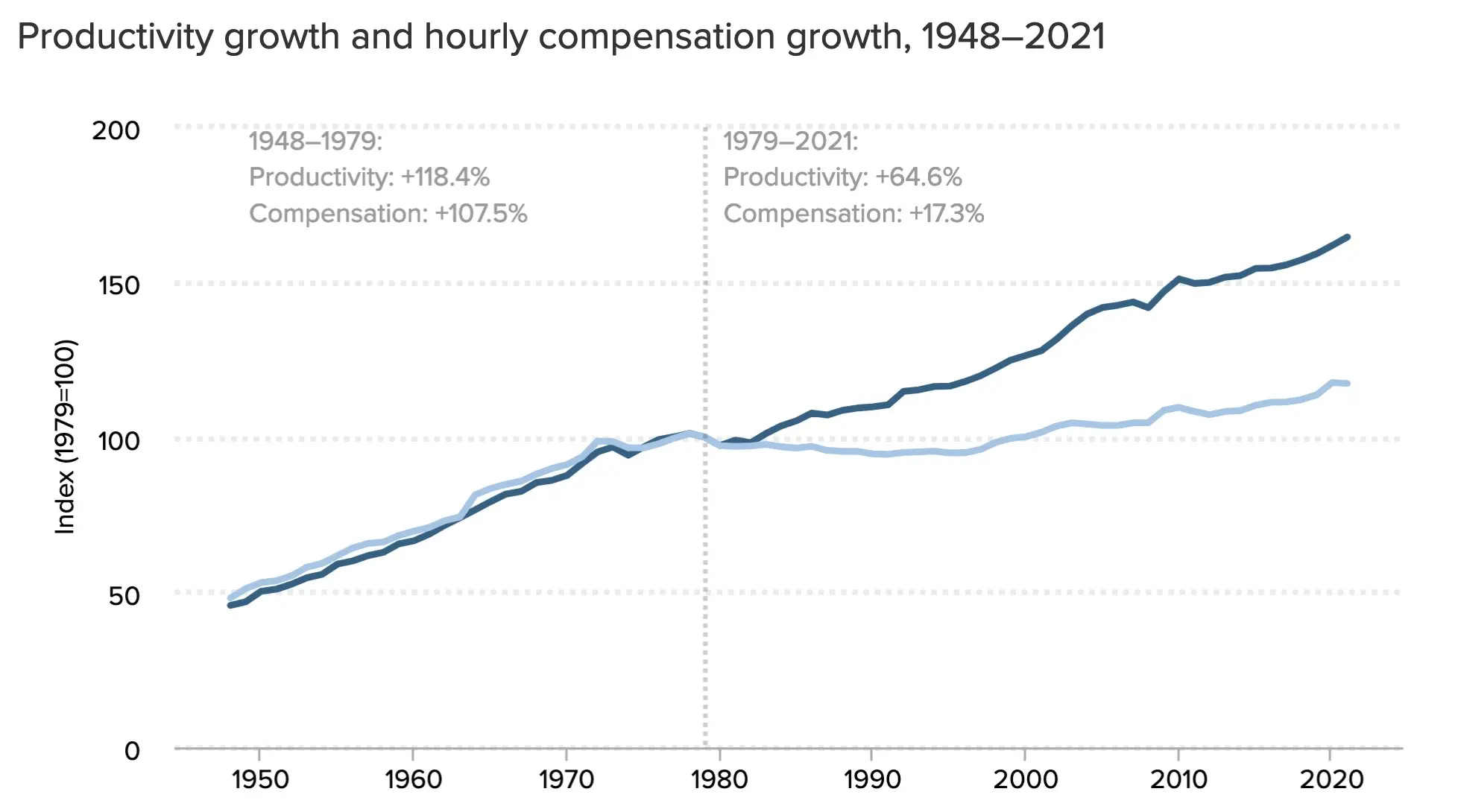
In any case, it’s worth discussing the productivity-wage divergence. Productivity is GDP divided by hours worked in the economy. Wage is the money you get in your paycheque. Compensation is wages + benefits (insurance, etc.).
There are several things going on at once in the wage-productivity divergence chart, so we need to unpack some labor economics.
Compensation vs Wage
Some charts compare wage growth instead of compensation growth. Tracking wage growth over many decades is a mistake in the USA.
This is because US Healthcare costs have grown at a ridiculous rate. US Healthcare is paid through insurance. That insurance is tied to employment income because of an idiotic tax deduction[footnote]Seriously, why no US political movement is pushing to change this is beyond me[/footnote]. It’s well known that increases in healthcare costs are directly removed from wages.
So if you measure wage growth in the USA, it’ll seem slow because wages are getting eaten up by health insurance.
The EPI isn’t making this mistake, but other wtfh1971 chart make this specific mistake:
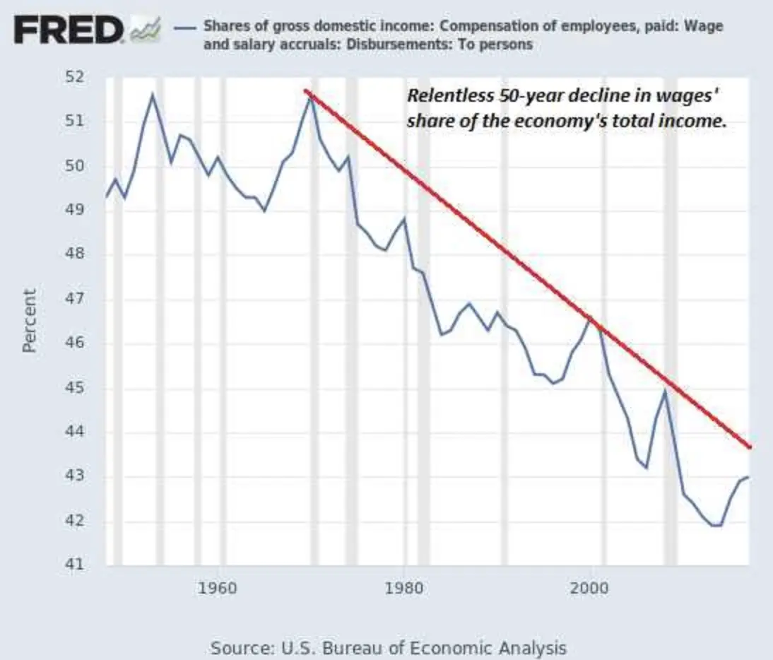
The “relentless 50 year decline in wages” should be labelled the “relentless 50 year increase in healthcare costs”.
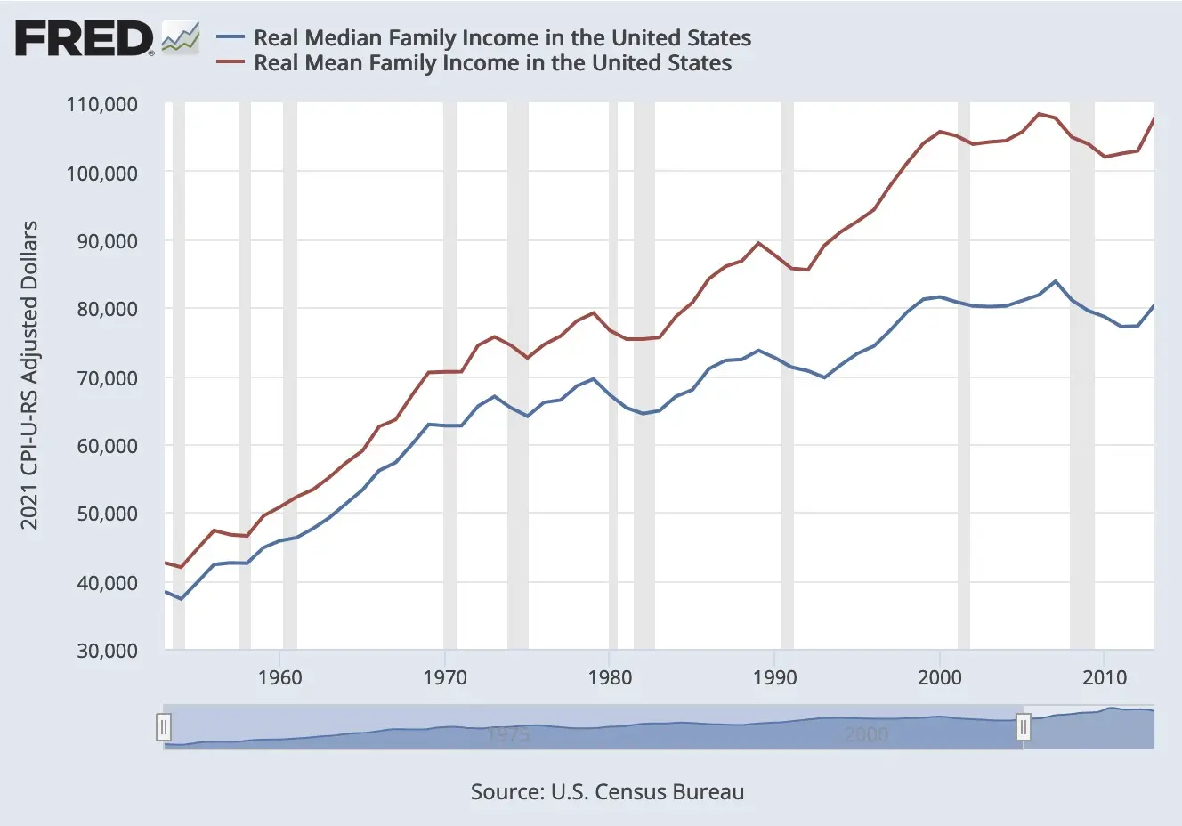
Median vs Average Wage
Notice that the EPI chart is plotting median compensation. As we saw in the post on the effect of automation on the labor market, wage inequality has been increasing. This means the gap between the average wage and the median wage has been widening:
A leading theory says this gap started accelerating around the 1980s because of skill-biased technological change. Basically: new technology like computers is more empowering for those that are already well paid. This means well paid workers have increasing wages, while lower paid workers, especially in manual labor, have stagnant wages.
There are other trends suppressing wage growth at the bottom of the wage distribution. As noted by Brookings:
the deteriorating value of the inflation-adjusted minimum wage, along with declining union membership, have lowered wages for many in the bottom and middle of the wage distribution.
Measuring median wage growth is indirectly measuring inequality growth, rather than actual wage growth over time.
Nerdy measurement stuff
If you measure an economic trend over 50 years, chances are the number you’re looking at is picking up all sorts of other trends along the way.
Terry Fitzgerald’s paper “where has all the income gone?” shows that the divergence in household compensation growth can be explained in large part by measurement issues.
First, simply using a different measure of inflation (PCE vs CPI) will change the income growth measured by 8%.
Then, the change in household composition explains much of household income divergence. Married couples make more than singles, but there’s fewer married couples since 1960. Take this chart from Fitzgerald:
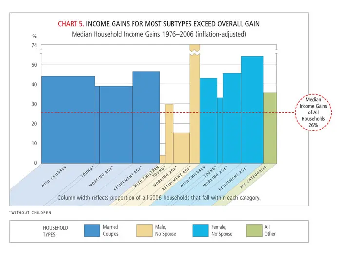
Fitzgerald explains:
This result seems like a mathematical contradiction: How can all subgroups grow faster than the entire group? But there is no contradiction. The explanation lies in the changing household mix. Married-couple households have much higher incomes than other household types, and there has been a large decline in married-couple households. This decline depresses overall median income growth.
Uh, maybe wtfh1971 was right that the divorce rate has something to do with it[footnote]No, wtfh1971 isn’t arguing that divorce has to do with wage changes, because he’s too stupid to get that relation[/footnote]?
The gold standard has nothing to do with any of this
A lot of charts on wth1971 are based in misunderstanding the evolution of the labor market since 1980. First, remember wage stagnation is, to some extent, real. Mostly for the lower wage jobs. But the general date economists pick to date the start of the divergence is somewhere in the 1980s, not 1971. Let’s helpfully re-annotate the wtfh1971 charts:
Stopping the conversion of the US dollar to gold didn’t help invent computers or lead to exploding healthcare costs.
Theme 2: Inflation Illiteracy
Another common one is charts just showing that wtfh1971 doesn’t know what “adjusting for inflation” means. Here is an example:
The chart just shows that inflation is a thing that exists.
As we’ve seen in the post on bitcoin/gold vs fiat money, low inflation isn’t bad. Having stable inflation at 2% is pretty great, actually.
What’s bad is deflation and especially high volatility in inflation. If you don’t know if inflation next year will be 1% or 9%, the uncertainty will make you skeptical to finance long projects.
The 1971 switch to a floating currency permitted the period of low/stable inflation from 1980-onwards:
Now compare this to this plot from wtfh1971:
This is not inflation adjusted data! The wtfh1971 chart plots inflation rate and nothing else. Notice it tracks the 1965-2020 inflation rate from the chart above perfectly.
Theme 3: House prices
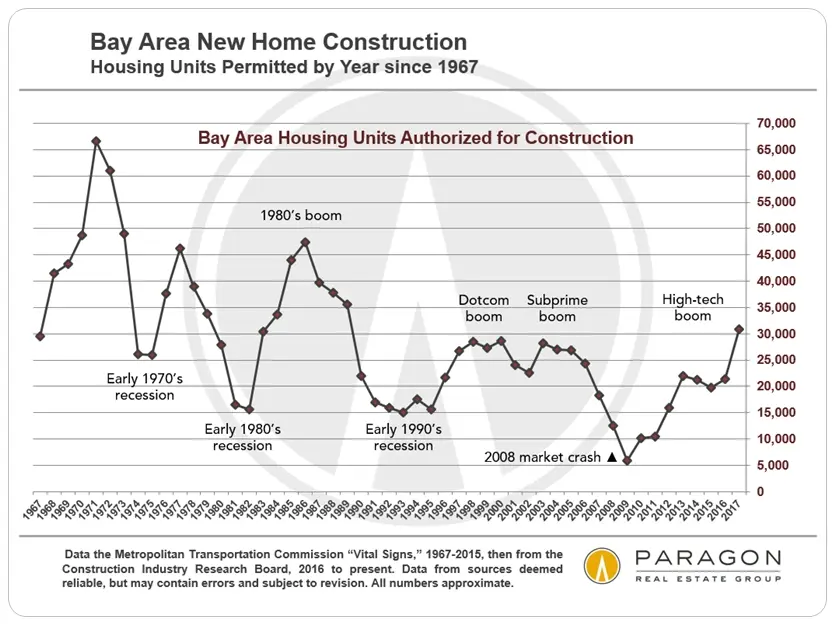
Another common one is house prices. Take this chart from wtfh1971:
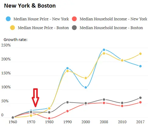
Apart from the fact that the trend starts in 1980 again, it’s clear housing prices have diverged from wages.
Covering why house prices went crazy merits its own post, but we can agree that, like healthcare and college costs, housing prices in metropolitan areas have grown out of control. This has to do with some factors:
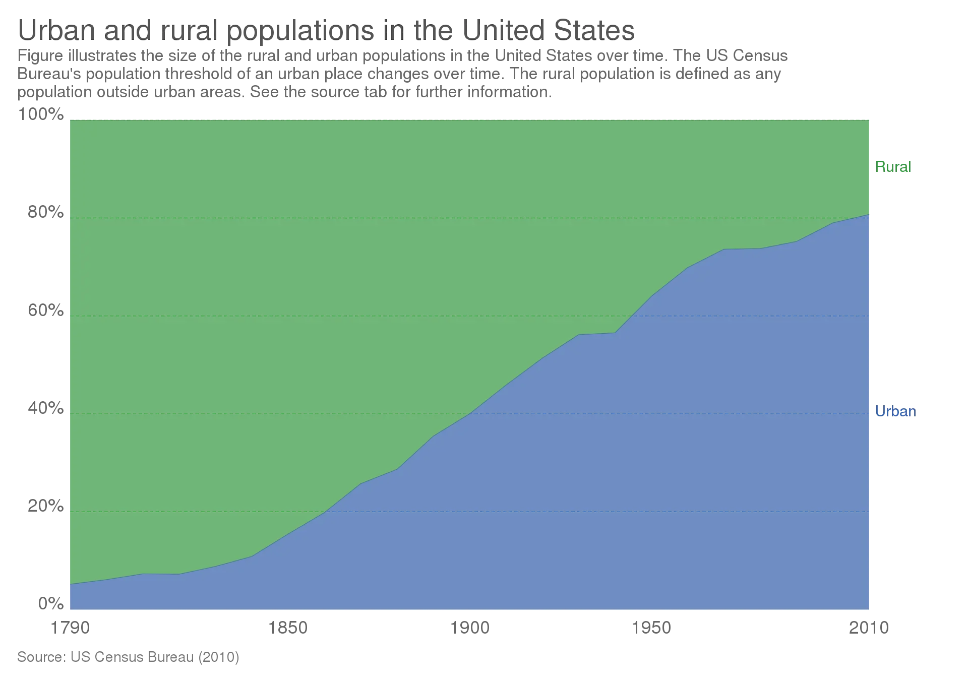
- People want to live in cities. From 1950 to 2010, the number of US people living in cities went from 50% to 80%:
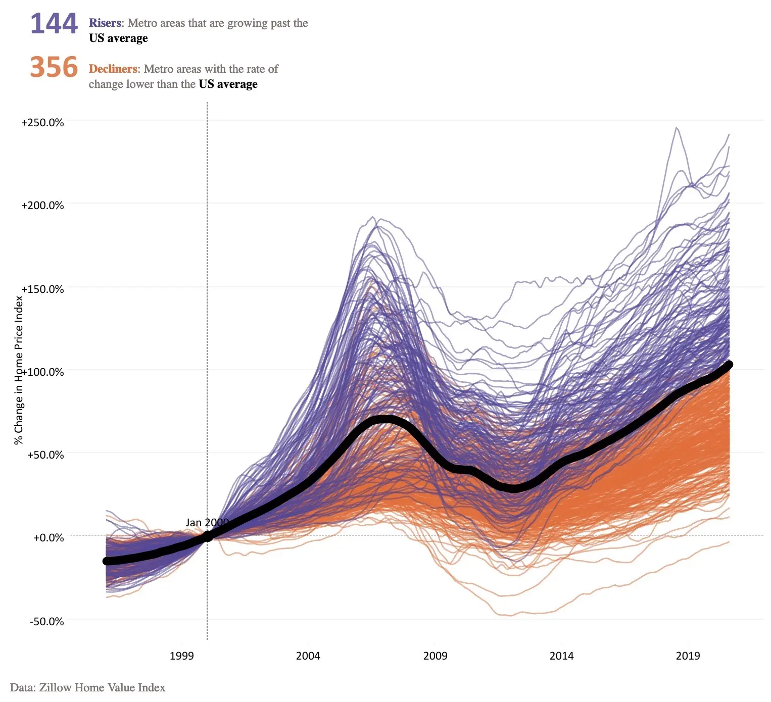
This means there’s a lot more pressure in the housing markets of some particular metro areas. People live in cities. No one is complaining about housing prices in places people are not moving to. Housing price growth is not evenly distributed:
- We aren’t building enough houses in cities. This is a discussion for another day, but in the cities people are moving to, we aren’t building houses. This is especially due to NIMBY issues like zoning & permitting. Note that the paper I just linked is from 2002! Zoning being bad for housing prices should not be news to anyone.
Also, how taxation is implemented affects prices and construction[footnote]Repeat the holy prayer: There is no tax but the Land Value Tax, and Henry George is the last prophet[/footnote]. A good example of this is San Francisco, which has been building fewer housing over time:
It should be a surprise to no one that a city which isn’t building new housing units, but where people move to, the housing prices will increase.
- Measurement issues (again). As we saw, there’s fewer married couples since 1960. Since people aren’t living together, this means there’s an increased need for housing unit per population.
Also, we’re not building the same houses we were in the 1970s. Much like the divorce rate affects measurement of wages, the kind of house being built affects measurement of home prices. We’re building larger houses over time, for fewer people:
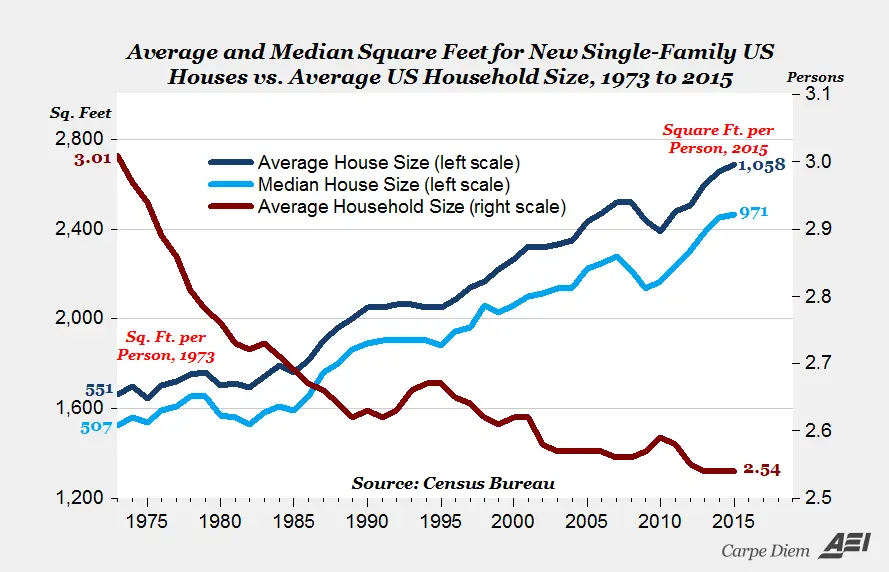
One reason house prices seem so bad is that we’re building bigger houses for fewer married couples. This is partly because the permitting and inspection process is much easier for a single family house than for a 5-over-1. That said, the price per square feet has been increasing nonetheless.
Maybe they have a point here?
The interest rate has a large effect on the housing market.
We know housing construction is tied to the interest rate. Since construction has to be financed on a loan, there should be more construction when rates are lower. Of course that won’t happen if home builders are bankrupt (see: 2008-2013) or if you’re simply not allowed to build stuff (see: NYC, SF, LA, Toronto, Vancouver, etc.)
Housing price is also tied to the interest rate. People buy houses with a 25 or 30 year mortgage, and if the interest rate is lower, they can afford a more expensive house.
If the housing market was healthy, these factors might balance out. But metro areas are in a housing shortage. If you go back to my post on bargaining power in the housing market, you’ll remember that if there’s a housing shortage, housing prices will follow the maximum price one can afford.
In that case, lowering interest rates means that for the same mortgage payment, people can afford a more expensive house. This means lower interest rates would increase housing prices, and transfer wealth from non-homeowners to homeowners.
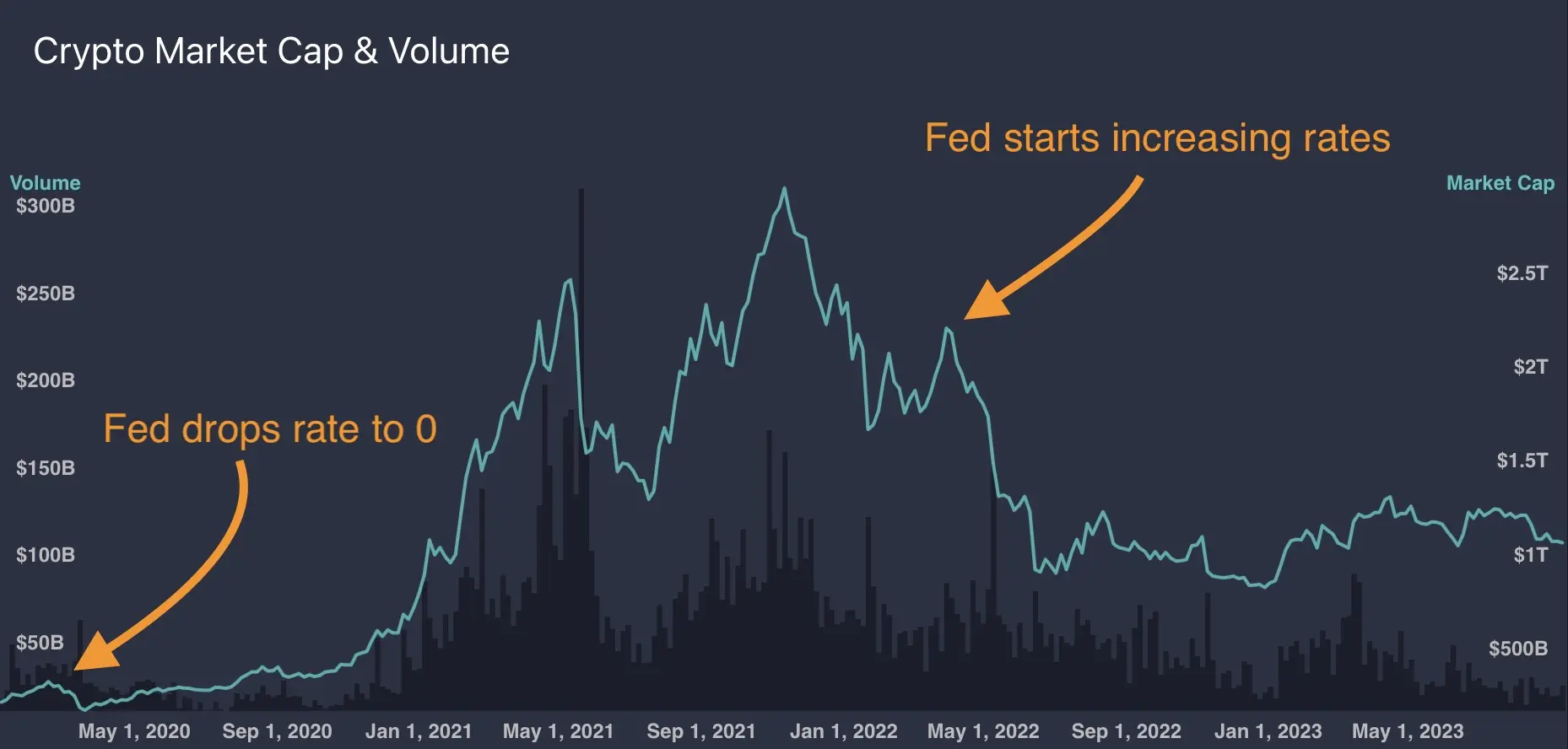
Low interest rates increase speculative behaviour, because they let people gamble on financial outcomes over longer time horizons. A recent example is the cryptocurrency mania of 2021-2022, and how it effectively stopped when the federal reserve increased interest rates.
The housing mania in the early 2000s was related to “exuberant expectations” - it’s plausible that the low interest rates during that period accelerated housing price growth.
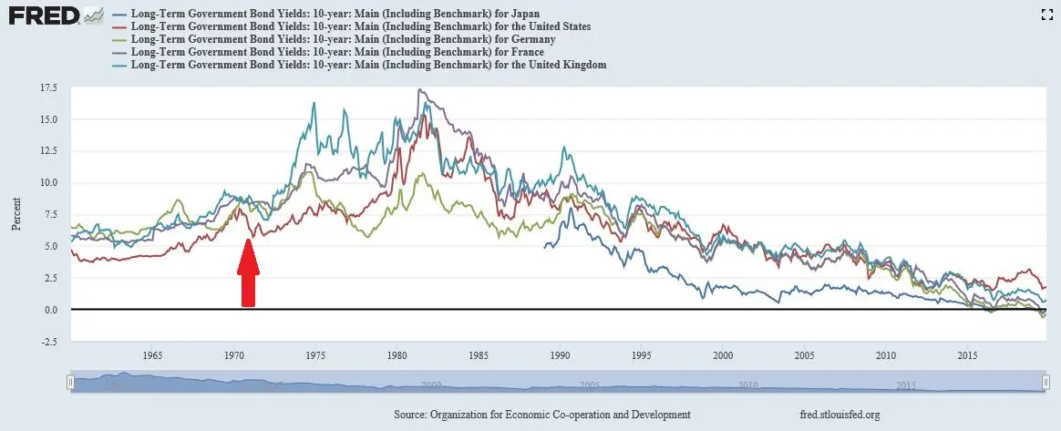
Now, remember that the interest rate has steadily decreased since the dollar has become floating:
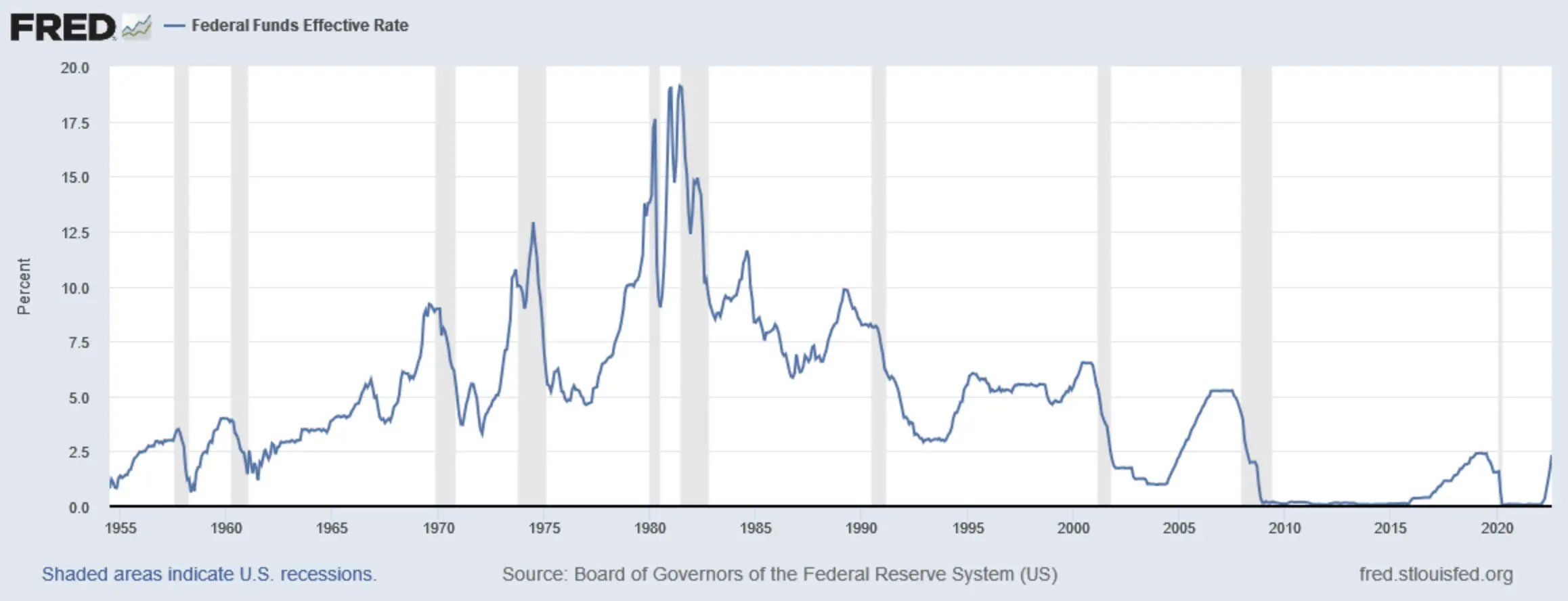
It’s entirely possible that over 5 decades, the interest rate going down has increased housing prices in areas with a housing shortage.
Houses are the one particular thing people finance over very long periods of time in their lives. It’s not hard to conceive that low interest rates act as a long term wealth transfer from people who own the scarce thing to people who buy the scarce thing with a huge loan.
By the way: even if this were true, it wouldn’t mean the solution to housing prices is to be found in messing with the interest rate. That’s a bad idea. Increasing the interest rate to lower house prices would mess up all sorts of other variables in the economy (unemployment rate, inflation, etc.).
The solution to housing prices is to build more fucking houses.
Theme 4: Autism causes Vaccines
The last, huge class of charts is “numbers are generally going up”. Because lots of numbers have been going up since 1971, you can correlate anything you want if you don’t do proper statistics.
A classic in the “numbers go up so they’re causing each other” field of study is Andrew Wakefield’s 1999 article that claims the MMR vaccine causes autism. Here’s the key chart in the article:
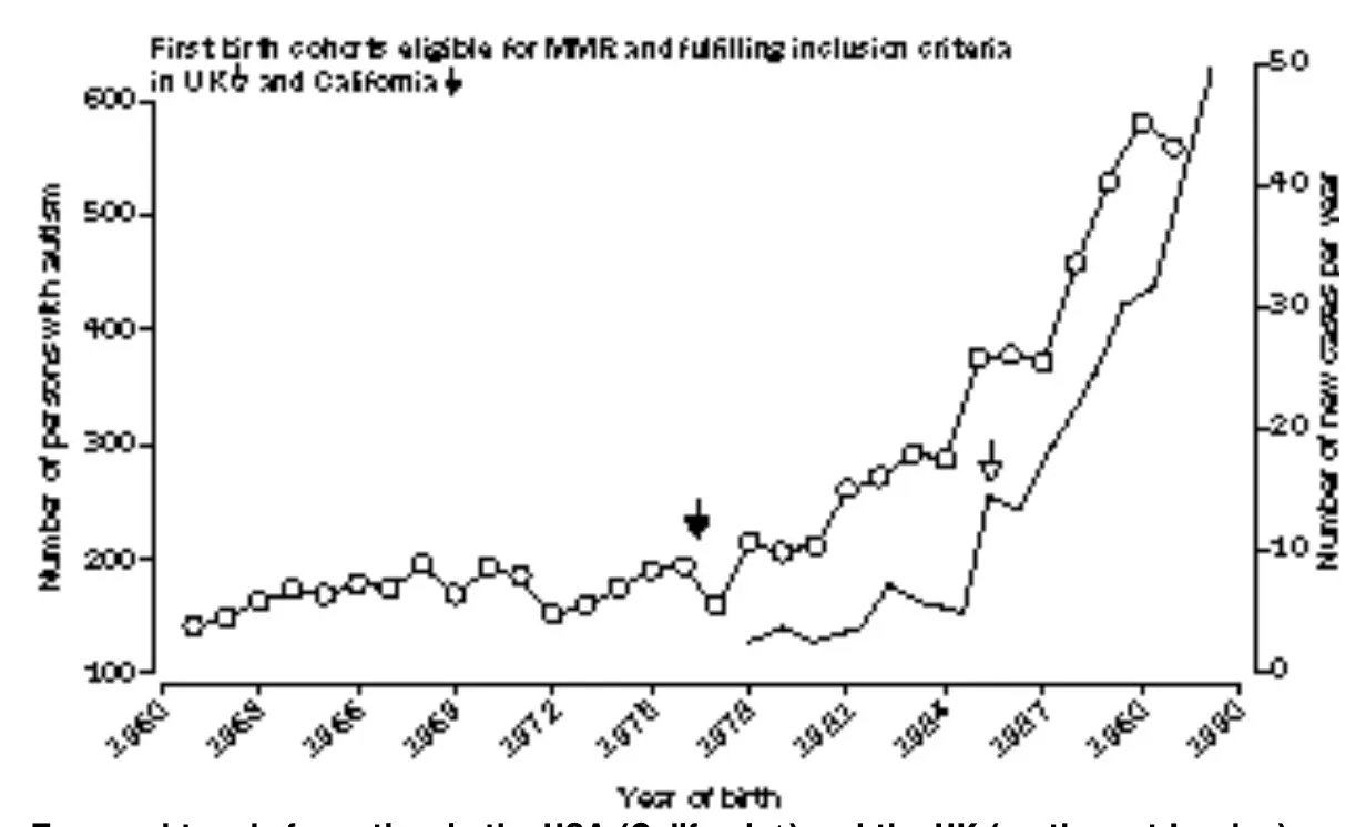
Notice a few things:
-
This is the original full resolution picture. The Lancet accepts absolute garbage quality plots, apparently.
-
Putting arrows on charts and inferring causality is an analytic technique Andrew Wakefield and wfth1971 have in common[footnote]I’m self aware, I know I also put arrows on charts. I never claimed not to be a crank, though[/footnote].
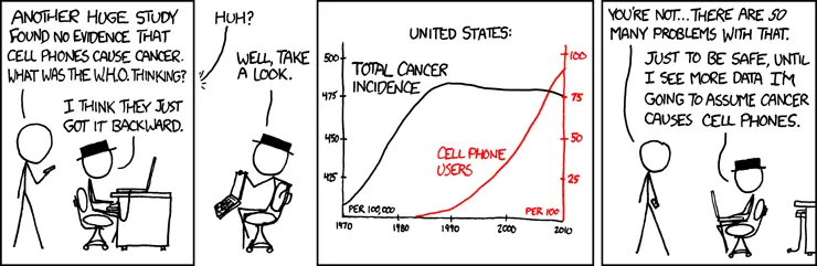
Again, a lot of things have been going up since 1970. Autism diagnosis, vaccination, cell phone usage, cancer diagnosis, whatever. We could also claim that cancer diagnosis causes cell phones:
Conclusion
Whatever, go buy bitcoin, I’m pretty sure it solves all of this.